Description
Every trader fears the bear market. But how many have actually studied one?
I spent time this week digging into SPY data going back to 1996, nearly 30 years, 7,650 trading days. The goal was simple: classify every significant drawdown, measure the cycles, and extract something actionable from the noise.
What I found was both sobering and reassuring.
The Setup: How to Define a Market Cycle
Before running any analysis, you need definitions. Without them, everything is subjective. Here’s the framework I used:
- Bear Market: drawdown ≥ 20% from peak
- Correction: drawdown between 10% and 20%
- Small Correction: drawdown between 5% and 10%
These aren’t arbitrary thresholds. They’re the ones that actually change the behavior of institutions, of retail traders, of the Fed. They represent different regimes.
The data covers SPY from January 1996 to May 2026.
The Bull Markets First
Let’s start with the good news. Over this 30-year window, SPY experienced 4 distinct bull markets:
| Start | End | Gain | Duration |
|---|---|---|---|
| 2002-10-09 | 2007-10-09 | +119.0% | 1,826 days |
| 2009-03-09 | 2020-02-19 | +520.8% | 3,999 days |
| 2020-03-23 | 2022-01-03 | +119.9% | 651 days |
| 2022-10-12 | 2026-05-27 | +120.6% | 1,323 days |
Average gain across all four: +220%. Average duration: 5.3 years.
The 2009–2020 bull market was extraordinary. 3,999 days. Over 500% gain. Nearly 11 years without a bear market. That kind of run distorts intuition. It makes people think the market only goes up. It makes them forget what the red side of the chart looks like.
Then March 2020 happened in 33 days.
The Bear Markets: Four Events, Completely Different Animals
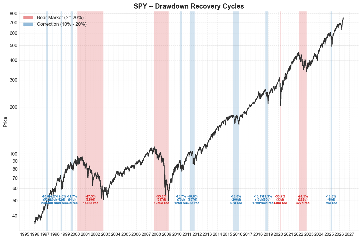
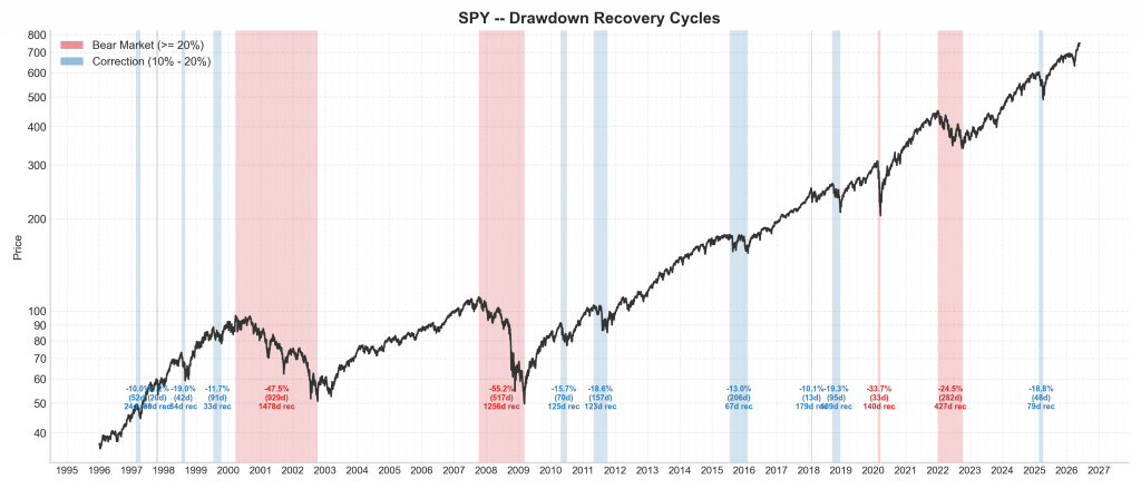
This is the core of the analysis. Four bear markets since 1996. Each one unique. Look at the chart below; the red shaded zones tell the story at a glance.
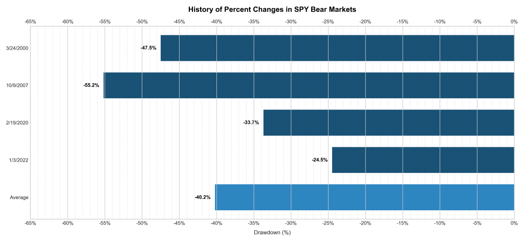
Now let’s look at the numbers.
| Peak | Drawdown | Days to Trough | Days to Recovery | Full Cycle |
|---|---|---|---|---|
| 2000-03-24 | -47.5% | 929 days | 1,478 days | 2,407 days |
| 2007-10-09 | -55.2% | 517 days | 1,256 days | 1,773 days |
| 2020-02-19 | -33.7% | 33 days | 140 days | 173 days |
| 2022-01-03 | -24.5% | 282 days | 427 days | 709 days |
Average bear market drawdown: -40.2%
That number alone should calibrate your risk tolerance. Not -10%. Not -20%. Forty percent. That’s what a bear market looks like on average.
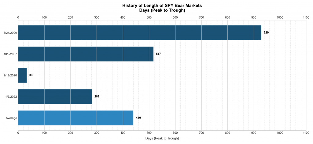
And the duration? The average time from peak to trough is 440 days. Then another 825 days to fully recover. Total full cycle: 1,266 days, over 3 years.
The 2020 COVID crash is the statistical outlier that warps intuition. Thirty-three days from peak to trough, 140 days to full recovery. Nothing in history looks like it. Government intervention, stimulus, and a liquidity flood compressed what could have been a multi-year event into a single quarter.
If you trained your bear market expectations on COVID, you have a dangerously optimistic model.
Corrections: The 10-20% Zone
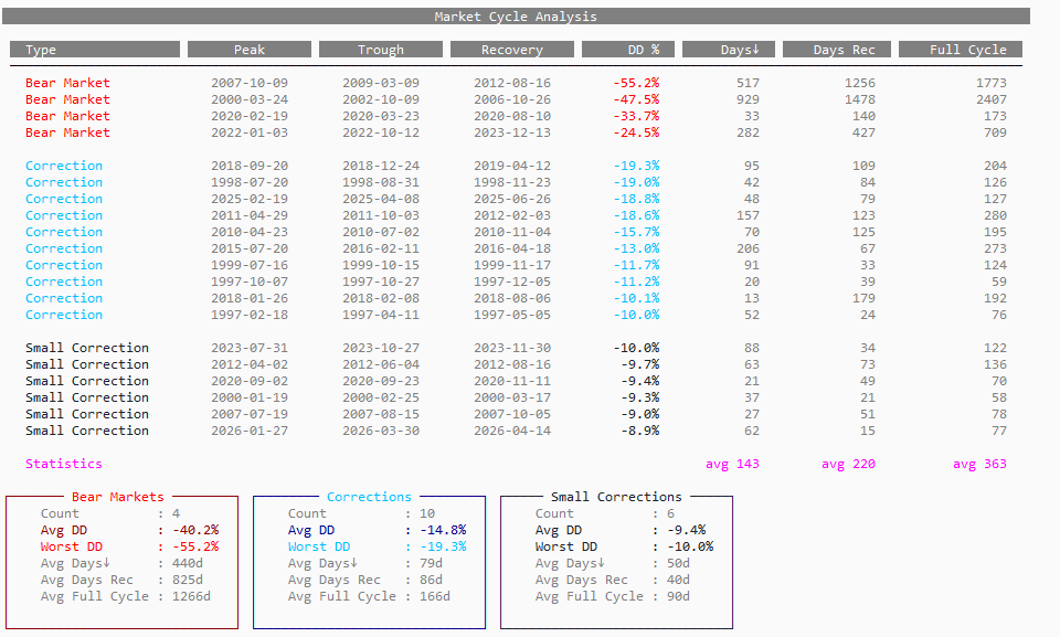
Ten corrections since 1996. Average drawdown: -14.8%. Average full cycle: 166 days.
These are the events that feel catastrophic in real time but resolve relatively quickly. The worst one? -19.3% starting September 2018, a full cycle of only 204 days.
The key insight here is speed. Corrections recover faster than bear markets by a factor of nearly 8x on a full-cycle basis. That’s not a trivial difference. It’s the difference between a strategy surviving and a strategy blowing up.
Small Corrections: The Noise Floor
Thirty-one small corrections (5–10% drawdowns) in 30 years. That’s roughly one per year. Average duration: 75 days. Average drawdown: -9.4%.
Most traders overtrade these. They feel like bear markets when you’re living inside them. They’re not. They’re the heartbeat of a functioning market.
The full picture, all cycles classified and annotated, is below:
What This Means for Options Traders
I’m not writing this as a history lesson. I’m writing it because this data directly shapes how I trade options.
When VIX spikes and the market drops 10%, is it a correction or the beginning of a bear? You don’t know in real time. But the base rates matter.
Since 1996, 10 corrections have been resolved with an average full cycle of 166 days. Only 4 events became full bear markets. That’s a ratio of 10:4. The data says corrections are more likely to be corrections than the start of something worse, but the 4 that weren’t killed unprepared portfolios.
The implication for defined-risk structures: in a correction, elevated IV means rich premium. Selling spreads with 30–60 DTE makes sense if your thesis is “this resolves in under 6 months.” The data support that: 9 out of 10 corrections did exactly that.
In a bear market, that same trade is a disaster. Duration alone breaks the math. You need to be in survival mode: reduce size, extend duration, or step away entirely.
Knowing which regime you’re in matters more than the strategy itself.
Final Thoughts
Thirty years of data tell a clear story. Bull markets are long and powerful. Bear markets are deep and slow. Corrections are sharp but temporary. Small corrections are noise.
The traders who survive and thrive are the ones who don’t panic during corrections and don’t freeze during bear markets. They’ve analyzed the event. They know the base rates. They have a playbook for each regime.
That’s the edge. Not a perfect entry signal. Not a secret indicator. Just knowing the history well enough to stay rational when everyone else isn’t.
The market has recovered from every single one of these cycles. All 45 drawdown events in this dataset. 100% recovery rate.
But recovery doesn’t help you if you got wiped out on the way down.
Trade with that in mind.
This is the mindset behind The Quantitative Edge — rigorous testing, clean implementation, and evidence-based decisions that turn statistical patterns into tradable strategies.
Statemi bene!
If you found this useful, you might also enjoy: